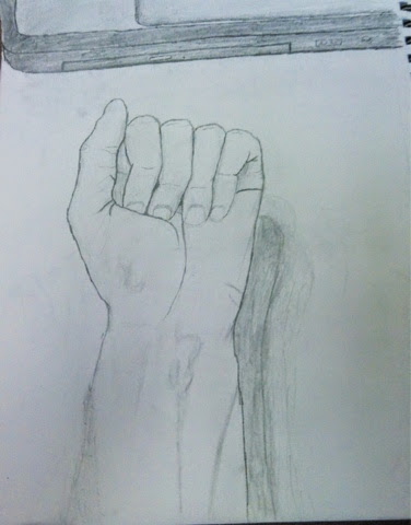

1. How does the comparison of the two drawings show how you have grown as an artist during this class? Explain how this work shows the development of your art making skills.
When you compare the two drawings, you can see a large amount of growth in my artwork. During the entire semester, I was able to improve my artwork in many ways. One way I was able to improve my artwork was making the space seem 3 dimensional. Early in the semester, a lot of my artwork, like drawings of hands, were supposed to look 3 dimensional, but did not. Throughout the semester, I learned how to make my drawings seem more realistic. Another skill that I learned was adding fine detail to my artwork. I was able to improve this in multiple ways. When I drew my hand this time, I was able to look at my hand and see all the fine details. This used to be more of a challenge, because I was not able to translate the fine details that I could see into my artwork. This brings me to the second way I improved, being able to actually draw fine details and proportions.Throughout the semester, I got better at getting proportions correct, and making the details like shadows and curves in the hands seem more realistic.

2. How did you apply what you learned in Art 1 to successfully complete the Identity Project? Talk about your knowledge of materials and what you've learned about working with themes.
During my time in Art 1, I learned a lot about making art. Art 1 helped me develop my skill in making art with pencil, and also helped teach me how to make an area look realistic. In this piece, I was able to make a space that looked realistic, even though I had nothing to base it off of. Since I was using pencil, I was able to apply all the skills I learned throughout the semester that used pencil. This includes things like shading, shadows, adding fine details, and much more. Throughout the semester we were given themes, and we were able to choose something that would fit the theme. During the semester I learned that when you are assigned the project, your best ideas are usually the ones that you get when you first hear about the project. I also learned that sometimes you can't do things exactly way you want them, so sometimes you do have to compromise with your vision and be able to change how you want it to look.

3. What was your most successful project this semester? Describe the project and your work, then explain why you picked it.
I feel that my most successful project was my Dark Side of the Moon piece. This was my first time working with oil pastels, and it turned out quite well. The bright colors of the rainbow and the triangle contrast well against the gray-scale of the moon and the space. Other than the sun and the earth, it is the only color in the piece, but the sun and the earth are much smaller, so the eye is drawn to the triangle and the rainbow. Using all the different colors for the rainbow also turned out well. While rest of the piece would stick to one or two colors, this used a large variety of colors. The multitude of colors also helped the colors seem to blend together. When I was doing the space for this piece, using white paper was very helpful. When I made the black of space, I realized that the white areas looked like stars, so I kept them. Due to all of these things adding up, and how good I think the final looked all together, I chose this piece.

7. What is a media that you enjoyed working with this semester? Write about what the media was, explain why you liked it and give examples of work you created with it.
I enjoyed working with the cardboard during this semester. Working with the cardboard allowed me to make one of my favorite pieces that I made during this class. Cardboard is a very interesting media to work with, because mistakes cannot be reverted, and you only have one way to change the way it looks. Due to how simplistic cardboard is, it makes it look very easy to reach your vision for the artwork. I was only able to create one piece with this media, (shown above) which I feel turned out very well.

8. In some of the projects you worked on this year you had a lot of choice about what direction to take and what materials to use. Explain your thoughts on how effective this was (or if it was not) for you.
I believe that being allowed to choose what direction to take helped me grow a large amount during this year. Being able to choose where you want to go with a project allows you to be more creative in your artwork, and usually allows all the people in the class to make art that is very different from one another. It allows you to express yourself through your artwork, which is an essential part of art. If the themes were too strict, everyone would have to make very similar artwork, and would not be able to make unique pieces that stood out. For example, in the piece of artwork above, I made a push pot that was functional, but also looked like a Pokemon. This project had a broad requirement, and due to this there were many pieces that were very different from each other.
3. What was your most successful project this semester? Describe the project and your work, then explain why you picked it.
I feel that my most successful project was my Dark Side of the Moon piece. This was my first time working with oil pastels, and it turned out quite well. The bright colors of the rainbow and the triangle contrast well against the gray-scale of the moon and the space. Other than the sun and the earth, it is the only color in the piece, but the sun and the earth are much smaller, so the eye is drawn to the triangle and the rainbow. Using all the different colors for the rainbow also turned out well. While rest of the piece would stick to one or two colors, this used a large variety of colors. The multitude of colors also helped the colors seem to blend together. When I was doing the space for this piece, using white paper was very helpful. When I made the black of space, I realized that the white areas looked like stars, so I kept them. Due to all of these things adding up, and how good I think the final looked all together, I chose this piece.
7. What is a media that you enjoyed working with this semester? Write about what the media was, explain why you liked it and give examples of work you created with it.
I enjoyed working with the cardboard during this semester. Working with the cardboard allowed me to make one of my favorite pieces that I made during this class. Cardboard is a very interesting media to work with, because mistakes cannot be reverted, and you only have one way to change the way it looks. Due to how simplistic cardboard is, it makes it look very easy to reach your vision for the artwork. I was only able to create one piece with this media, (shown above) which I feel turned out very well.

I believe that being allowed to choose what direction to take helped me grow a large amount during this year. Being able to choose where you want to go with a project allows you to be more creative in your artwork, and usually allows all the people in the class to make art that is very different from one another. It allows you to express yourself through your artwork, which is an essential part of art. If the themes were too strict, everyone would have to make very similar artwork, and would not be able to make unique pieces that stood out. For example, in the piece of artwork above, I made a push pot that was functional, but also looked like a Pokemon. This project had a broad requirement, and due to this there were many pieces that were very different from each other.